New Frequency Central Website
The Frequency Central website has been in sore need of an update... This is that.
For years, Frequency Central has been represented online with a very out-of-date website that just listed information about products with no way to purchase them. My main project for the summer of 2019 would be to implement a new, up-to-date website with current images, data, and descriptions that allowed customers to buy directly from us easily.
The old Frequency Central website was incredibly outdated. It was also cumbersome to update because a products’ information had to be entered by hand across multiple pages. Take Waverunner for instance - if we wanted to change the graphic or text of Waverunner, we’d have to change it on the EU Synth DIY page, the EU Synth page, the Waverunner DIY page, and the regular Waverunner page. That’s a lot of effort.
Considering that a recent shift that had occurred within Frequency Central is the transition from silver panels to black panels, and we were looking at having to change hundreds of pictures on hundreds of pages. It was just untenable. It got to the point where we didn’t create new pages for products because the rest of the website was so out of date.
Equally inconvenient was the fact that the website just served as a place to host information - customers couldn’t buy our products through the website, they had to email us or go to external distributors. This doesn’t give out a good message!
So my task was, at it’s core, to collate the current, up to date information and pictures for all of our products, host it on an e-commerce platform, and design a theme that is suitable for our purposes. Additional tasks would involve measuring modules to get data, editing photos, writing descriptions, etc.
I chose to build the new website on top of Wordpress because it would be a familiar platform for the site’s main content authors to use. I wasn’t particularly familiar with Wordpress, WooCommerce, nor PHP, but I guess it proved to be a good opportunity to learn and expand my horizons.
It might seem that setting up a WooCommerce site is a simple endeavour, as ‘everything is already done for you’, but I ended up writing thousands of lines of custom PHP code in our functions.php file, and probably hundreds more in editing templates too.
When editing templates, I found it difficult to track down exactly what function created a specific part of the default WooCommerce templates sometimes. I ended up having to isolate something specific that I wanted to edit - perhaps a function name or HTML class or id - and then grep for that string across all the files and folders in the WooCommerce plugin directory, and then work back from there to find the appropriate place to make my changes.
We wanted a very minimal theme for the website, and I hope you’ll agree that that’s what I produced. I took some cues from ModularGrid, and others from SynthCube, but simplified things a lot to get a nice clean look. It was really surprising to me how many of the free Wordpress / WooCommerce themes include unnecessary clutter everywhere. I didn’t like most of the themes I looked at. The clutter wasn’t very appealing, and often customers would have to jump through hoops to actually make a purchase. I didn’t want that, I wanted it to be very simple for a customer to purchase from us, so tried to avoid drop-down menus, sidebars, etc, wherever I could.
Clutter on websites is a common problem across the web, in my opinion - I personally find even Amazon difficult to browse because the design is all over the place.
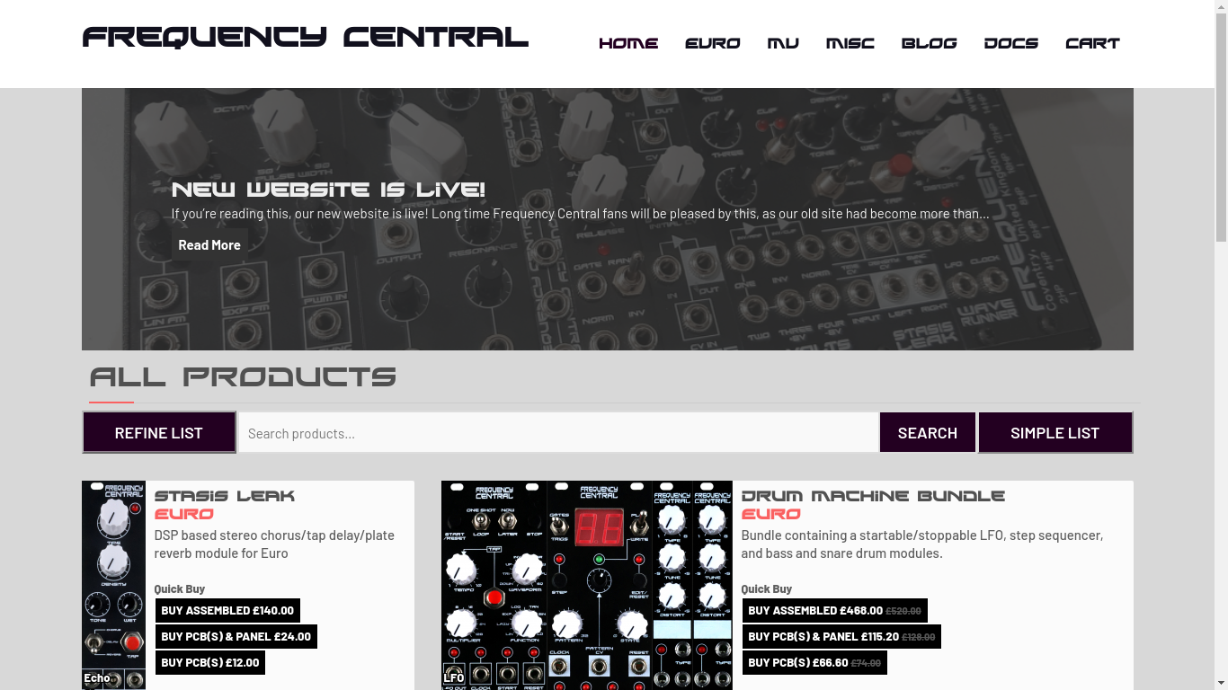 New Frequency Central website design.
I spent a lot of time trying to create systems so that the data for our website could be entered in a machine readable way. I wanted to be able to generate things across the website with our data, without requiring user input. For example, the Documents page is updated automatically as datasheets and user guides are added to products. The same is true for the Chipsets and Useful Documents sections on the product pages. This is particularly useful for Bundles, where the data for Chipsets and Useful Documents are imported from the bundled products, so that you don’t have to add those things a second time. I tried to ensure that there was a authoritative source for data and information, so that changing it in one place would update all of the other pages that use that information too. I really wanted to avoid pages going out of date, as that was what made our last website completely unmaintainable.
I was also able to use the machine readable Chipset data to notify customers when they were buying products that used specialist integrated circuits. It’s important to notify them that they can purchase it from us so that they can avoid the difficulty and frustration of trying to acquire it mid-build. This was particularly important for one of our newest products, Stasis Leak, as the Belton ABE-FX is incredibly new and therefore probably hard to acquire in certain countries. This notification seems to have helped many of our customers, as they purchased their integrated circuits as separate line items from us during the checkout process. It makes me smile to know that functionality I implemented was worthwhile and helpful.
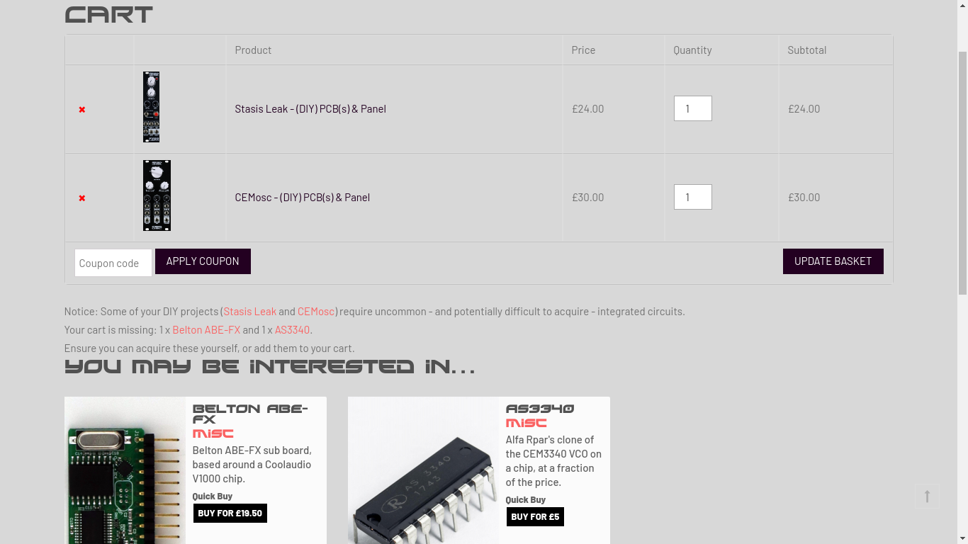 Cart notification about potentially difficult to acquire chips.
Another importance for me was to try to streamline processes for the website administrators. I was always thinking about what I could do to make using and maintaining the website easier for the folks running Frequency Central.
I tried to simplify the WooCommerce products form, which I found to be particularly egregious. The default WooCommerce products form is a mess, and has many tabs that you have to click through to enter all of your data. If you have to click to every tab, then having a tab system isn’t saving you any time. It’s just adding extra clicks.
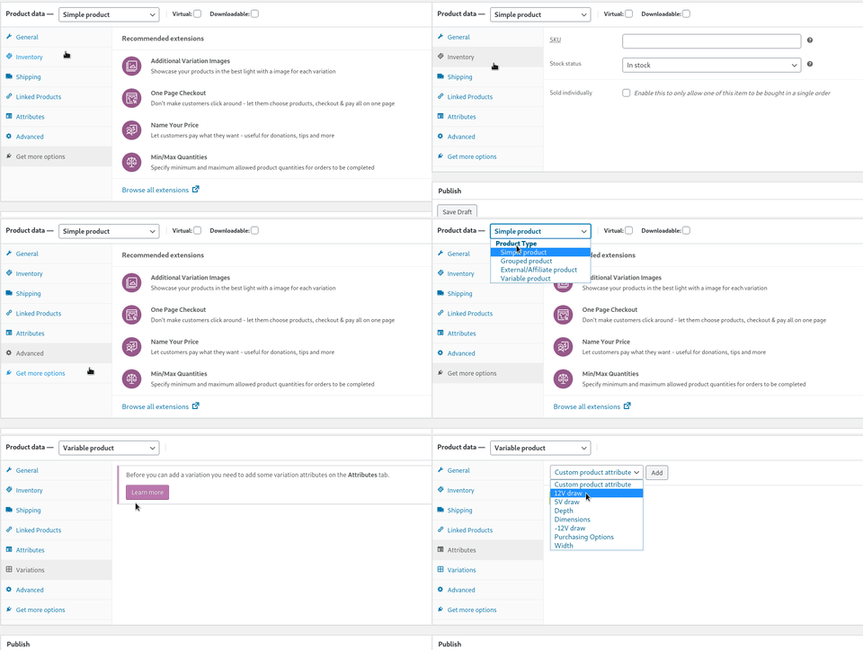 Scrolling through tabs is so unnecessary. I wanted to remove this.
I used CSS and JS to convert it into a simple form with no hidden sub-menus, hiding data fields that we wouldn’t be using, and revealing forms that you have to click through to access. I also took the opportunity to auto-fill data to sensible defaults that I figured we’d select most commonly. For those wondering, I chose to use client side JS and CSS rather than server side PHP because I didn’t want to edit the core WooCommerce files that generated the page.
A comparison of creating two product variations in the old system and the new system are show below.
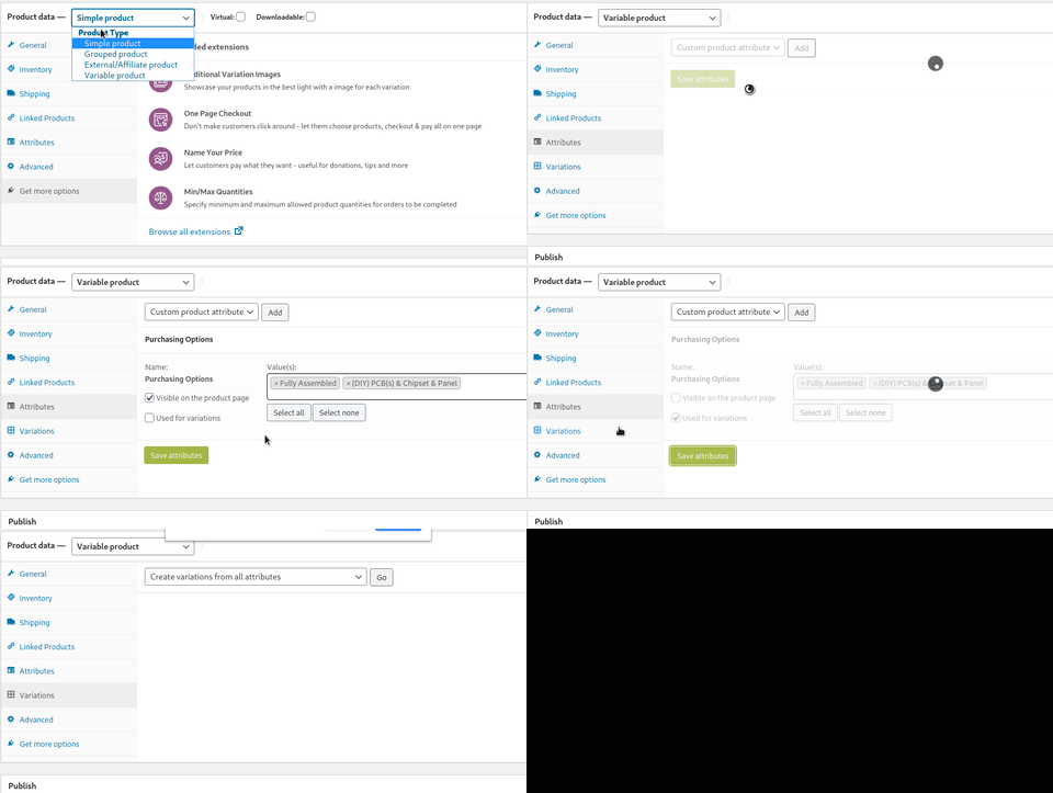 Old system: Trying to create two product variations in the default WooCommerce menu. Mistakes were unintentional - they happened naturally because the menu is not intuitive.
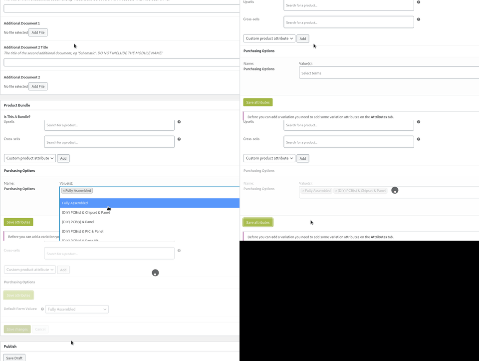 New system: Creating two product variations in the new menu that I edited. Nice and quick!
I also implemented custom order export functionality that integrated perfectly with their workflow, to make order fulfilment quicker and less prone to errors.
The website launched on November 19th 2019. Our customers were very enthusiastic to make purchases, and it completely blew away our expectations. Feedback was immensely positive across the board. I was particularly surprised at how many of the customers chose to sign up to the mailing-list to receive email updates whenever Frequency Central launched new products - within just a week FC already had more subscribers than my personal email list.
Frequency Central is finally in the twenty-first century!
P.S. I'm late to the party, but I recently got a twitter account that you can follow here.