RobCo Revisited
In anticipation of Fallout 76, I reworked the issues with my take on the Hacking Minigame. Was it worth the effort?
Two years ago, in an effort to learn HTML, CSS, and JavaScript, I created the hacking minigame from the 3D Fallout games. I needed something to show when the player successfully ‘wins’ the game, so I created my blog for that purpose. I was very proud of the end result, but always felt I could do better. In anticipation of the release of Fallout 76, I decided to make those improvements.
That version of the Hacking minigame was one of my first attempts at anything web based, so there were many flaws. I simply didn’t know how to do things the way I do now, and StackOverflow’s suggested solutions are often written with horrible hacks. For example, when I added new DOM elements, I did so like this:
javascript
mydiv.innerHTML = "<span class=\"symbol">ALPHA</span>";
These ‘newbie’ approaches caused a lot of ‘bad code smell’, generally made things slower, and were not very maintainable.
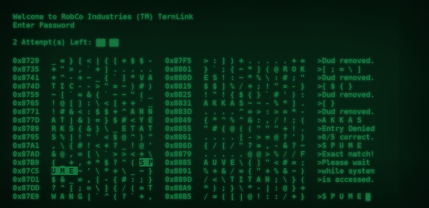 Image of how the minigame looked in 2016
The Problems
The main problems were these:
Some horrible ‘code smell’ things, as mentioned above. In particular, this made the game feel a little ‘laggy’ or ‘janky’, as the user scrolls around.
Words for the Minigame were downloaded in a huge 12,000 line long script file, that was something like
var words = ["ABRAM", "ARRAY", ...];. This was really slow to download and parse (causing a several second delay before the minigame did anything) and limited me to puzzles with just 5-letter words. I didn’t do much to make these words similar, either, I just picked random ones from the list. This meant that most guessed would have a 0/5 success, which wasn’t very fun.My blog posts were all statically in the HTML downloaded as part of the main file (including the images), and the terminal code just hid/displayed the correct ones at the right times. This really wouldn’t scale as I made more posts, and users would have to download all this content even if they weren’t looking at it!
Lack of effects - there are lines all over the screen in Fallout 3 that are meant to enhance the idea that it’s a CRT monitor, as well as a hum sound; I didn’t have either. Additionally, although I had made some provision for terminal-ifying images (ie making them greeeeen), it wasn’t faithful to the game, and I hadn’t considered video at all so those displayed in full colour.
Lack of the ‘opening crawl’ that is meant to simulate the player character typing commands into a command prompt. The original version just had a blank screen until the game loaded. Additionally, in the Fallout series, the terminal doesn’t just paste everything to the screen at once, but instead it loads it character by character along with a nice little ‘blipblipblip’ sound.
The game was straight-up broken on mobile. It showed as a tiny thing in the corner of the screen and it was impossible to click anything.
There was no information about it. If someone found it through Google (which is possible as I tend to be ~5th position for ‘RobCo Terminal’), it would only be when they won that they discover it goes to my blog posts, which might not be expected. A random person finding my game probably has no idea who wrote the posts, and the post-minigame screens don’t tell you much.
Lack of favicon, meta tags, etc. Basically all those nice little things no tutorial covers.
Addressing The Issues
I’ve decided (a number of times since I first made it, actually) to go back and address these issues. I’ve had to go over a handful of times to add support for things I started using on my main website, for example when I started using headers.
As such, consider issue 1.) as having been resolved throughout the whole process.
AJAX Cleans Things Up
A year after I originally made the game in November 2017, I had learned about what AJAX is and how to use it. AJAX is a way of requesting information from other places on the web from the client side of a website.
Shortly after creating the hacking minigame, I created my main website. This meant that my blog posts were now hosted at a URL, so I could request them via AJAX. This meant that I didn’t need to embed my post content into the hacking minigame, and could download it only when needed, reducing bandwidth usage for the user and downloading faster. This resolves issue 3.)
Similarly, rather than embedding a list of 12,000 words into the minigame, I could request words from somewhere. I considered requesting from one of the many websites that has word lists, but I decided to play things a little more smart.
Heroku hosts a platform-as-a-service, which allows you to run little bits of code online. I’ve used them for a handful of projects, which gave me the idea of having a Heroku Dyno that knows lists of 5 to 10 letter words, and sends back a handful. As I was developing it, I realised that I could do some processing to give back better words. Picking random words isn’t very interesting, so what if we send back words that are similar to the goal word?
The Fallout Hacking Minigame uses the concept of a Hamming Distance to calculate how many characters are correct. For example, a hamming distance of 4 means that 4 characters are incorrect. The code I have developed to select words picks a random word length (for example, 7 letters), and then searches through it’s list of 7-letter words. For every word it picks, it records the hamming distance. It tries to get four words with a hamming distance of 7 (ie all characters are wrong), four words with a hamming distance of 6 (ie only one correct character), four words with a hamming distance of 5, etc.
You can check out an example of the words my Heroku code gives back by clicking here. You should see that the words go from being completely different, to quite similar! All the terminal hacking code has to do is request that page, parse it, and then insert the words. Great! Again, much faster, reduced bandwidth usage, resolving issue 2.).
 A list of words generated by my Heroku Dyno
The use of AJAX to resolve these issues caused an additional problem - what happens if the network connection isn’t great, and the AJAX request fails? I didn’t address this at the time I added the AJAX, so now we had a new issue.
- When AJAX fails (ie due to a poor connection, or because my site is down, etc). then the minigame enters a position where it can't do anything and hangs, which doesn't lead to a good user experience.
AJAX fallbacks
Resolving the ‘new’ issue 9.) was my first priority when I started working on this again two weeks ago, as it is the most clearly a programming ‘bug’ when compared to other things.
When AJAX fails (ie when the XML HTTP Request completes but is not successful), I now have a set of fallback words for the Hacking Minigame, which allows it to continue working as if there was no problem.
Solving the AJAX fail on loading a post would require a little more creativity. I can’t just have a ‘fallback’ post to show, it doesn’t make sense. Instead, I’m calling on the fact that these terminals in the Fallout universe have been through an apocalypse to be my saviour. Many terminals in the Fallout series will have little sections that just spit some garbage at you and complain about data corruption or something similar. There’s no reason I can’t mask my network issue as a data corruption issue!
A created a script that gives random characters mixed with a (small) selection of ‘pre-corrupted’ words. My corruption errors aren’t “intended” to be seen, so I didn’t want to spend too much time on engineering them and making them complex. I like the effect!
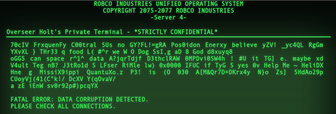 A sample of the corruption error
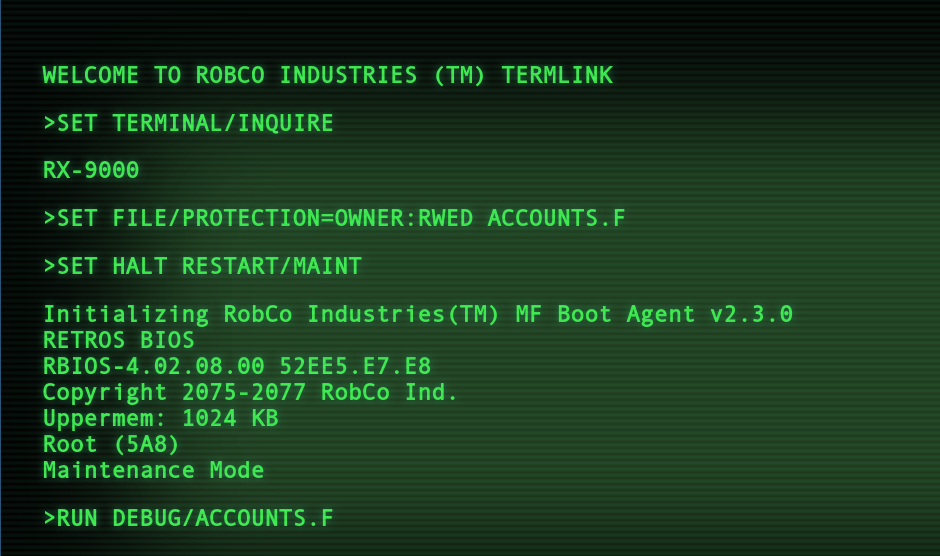
SET TERMINAL/INQUIRE
The next part I wanted to work on is the opening crawl. I reckon a lot of players might not remember this, as you’ll very quickly get in the habit of double clicking to skip it completely. That said, I think it’s a really cool part of the whole terminal experience, and I really wanted to add it to resolve 5.).
I have to admit that the way I have chosen to implement this isn’t the best one. JavaScript contains a setTimeout function, where you can give it a snippet of code to execute, and a delay amount, and it will execute that code after the time has elapsed. Great! All solutions will probably use this.
Where my solution has gone wrong is that I decided to chain these together, rather than going back to some common code. This means that in my solution, the browser has to keep track of several hundred function calls that I have chained together. This is another piece of technical debt that I should solve, but realistically I’m not going to as it isn’t causing any problems.
I have a set of objects which have the different lines of the opening crawl, indications of if it should place a typing noise or a machine noise, and the duration of the delay between the different characters.
I later had some issues with the opening crawl on Mobile, as in some places I was using double line breaks to position lines more accurately, but for some reason mobile browsers freak out when you do this and mess with the line spacing. Addressing this has made the final solution a lot more complicated than I described here, and more complicated than I would like. It isn’t really worth explaining, though, without being able to see the problem.
Making It Prettier
My original version of the hacking minigame had some honestly quite dull colours. I had tried hard to get the colours to match Fallout 3 exactly, but I didn’t quite manage it.
I decided that whilst reworking this, I’d move away from complete faithfulness to Fallout 3 and embrace Fallout 4 a little more. Fallout 4 has very lime-green text against a fully-black background, which makes it bright and easy to read. I decided to go for a colour scheme that is a cross between Fallout 3 and 4, with a much brighter colour, but also with the greenish background that 3 had.
At the same time, I added CRT-like lines across the screen. I can’t remember where I got the inspiration for how I implemented this effect, but it uses the before pseudo-element of a DIV. Unfortunately, adding this effect really made the game lag massively on Firefox and Mobile Browsers. It took me a few days to figure out that these browsers didn’t like the box-shadow property (that I was using to create a darker gradient at the edges of the screen) when combined with the ‘pulsing’ of the CRT-like lines. (Presumably because there is a lot of Math involved to calculate the box-shadow, and it has to be recalculated every time the opacity changes of the lines.) I ended up swapping the box-shadow for a image that I created of the same thing. The effect isn’t quite the same, as I couldn’t get mix-blend-mode to work how I wanted, but it’s much faster and that’s what matters.
Because I was playing with mixing colours, I decided to look back on how I was treating images. When I first created the hacking minigame’s blog portion, I had thought there were no terminals in the Fallout series with images. I knew the PipBoy had them, but I had forgotten that the Overseer’s Terminal has two pictures right back in Vault 101 in the intro of Fallout 3. The effect I had didn’t look right at all. The effect in the game had some real distortion and quality changes, rather than just changing the hue.
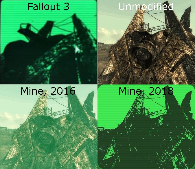 Megaton Images, in Fallout 3, and in my old and new attempts. Please note that blur in Fallout 3 image is only there because I scaled up a small-resolution screencapture.
One of the pictures on the Overseer’s Terminal is of Megaton. I found a similar picture online and experimented with different image manipulations until I got something I liked. By applying a filter to increase the contrast and make the image monochrome, then applying blend modes with both my background colour and my text colour, I was able to get an effect similar to the game. Note that in the image above, the one from Fallout 3 appears blurred, but that is an artifact of how I generated that image. The image ingame is not blurred.
My updated effects resolved issue 4.)
Mobile Malfunctions
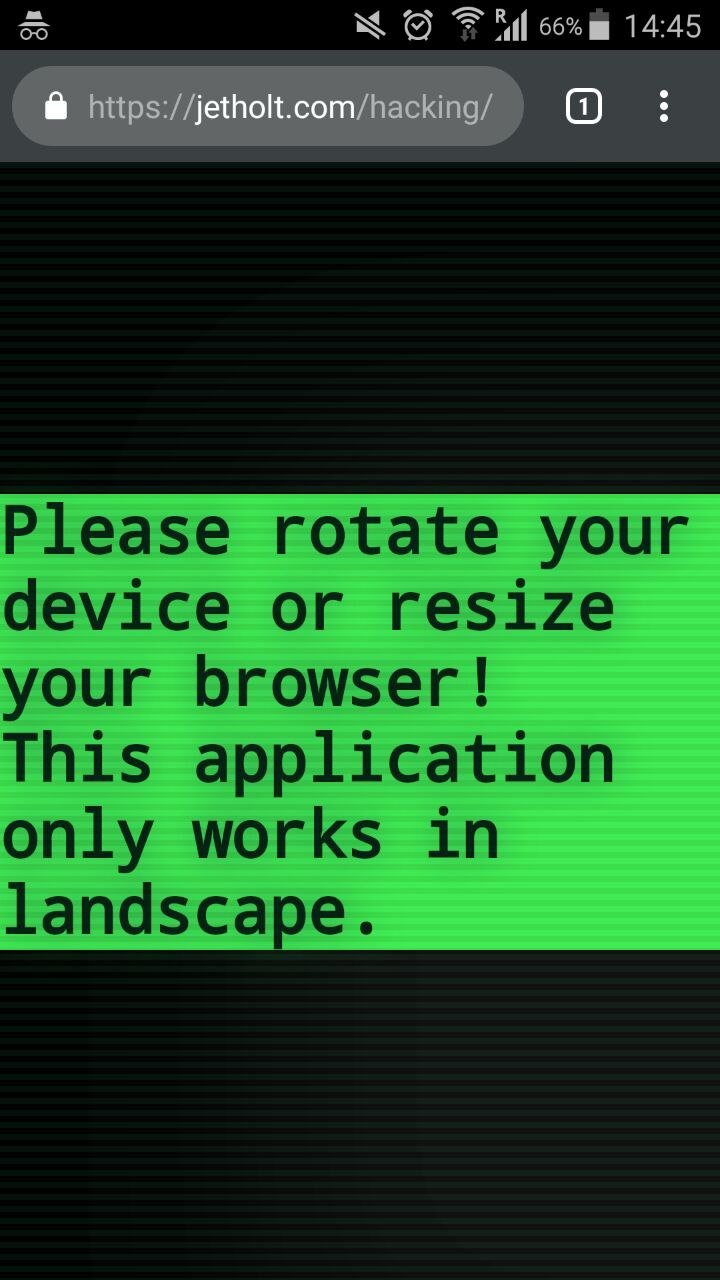
My first idea to resolve the mobile issue would be to force the screen to rotate into landscape. After some searching, I couldn’t find a way to do this, so I went with the next best thing, which would be to request the user do it, and prevent them from using the application if they don’t. We can do this pretty easily with Media Queries.
Unfortunately, I had another problem. Mobile browsers choose to hide the address bar when the page scrolls down. Sadly, my application’s layout seemed to always “believe” that the address bar wasn’t there, whilst the background seemed to “believe” that the address bar was always there. This meant that when the address bar was present, you couldn’t see all of the content, and while the address bar was absent, the background looked awful.
I didn’t properly solve this, not really. Instead, I force the user into fullscreen mode, which “solves” the problem (as both layout and background know that the address bar isn’t there), but the problems are back as soon as the user leaves fullscreen mode. If there is a proper solution to this, I couldn’t figure it out. But I feel like 6.) is resolved enough, as the game is usable on mobile now.
Final Touches
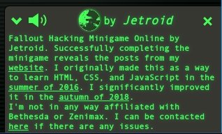
One of the last things I did was add a little dialog in the bottom right, saying that it is by me. I was inspired by Levels and Daniel, who have similar tags on some of their projects. In this instance, I styled mine in the same way as the terminal.
I decided that I would make it so that the dialog can be expanded to give more information and background. I also made sure that it can be clicked away from, so that it doesn’t spoil the experience. Whilst I was there, I decided to give it a way to mute the terminal sound effects. This neatly resolved issue 7.) without having to create an about page. The fact that the dialog is usable from within the minigame means that I reckon people are more likely to look at it.
Finally, I went and added all of the appropriate meta tags (so that it looks correct when shared on social media), resolving issue 8.). This site is pretty comprehensive about these, if you don’t know about them.
Reflection
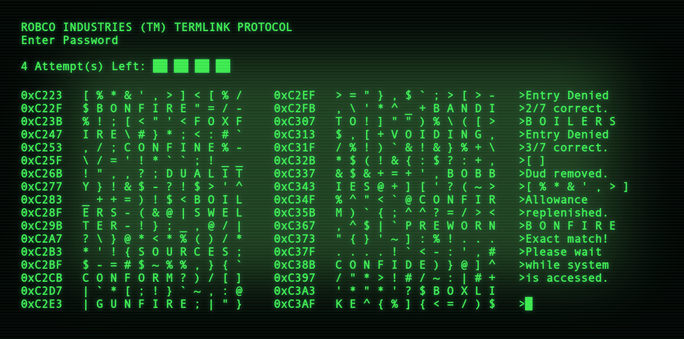
I’ve always really like the Fallout Hacking Minigame, especially conceptually. The minigame is styled to look like a hex dump. The hex pointers to the left of the symbols (where the words are) increases by decimal(12) each time, and there are decimal(12) characters per line, so the pointers clearly refer to the memory address of the different symbols, which I like. The whole concept of the minigame is based around the fact that sometimes passwords can be found plaintext in a dump file from when a program crashes, and that attention to detail is great. It isn’t just some abstract concept that doesn’t make sense!
I’ve had a lot of compliments about the minigame from friends I showed it to over the years. It’s hard to show off some of my other projects in a way that somebody can appreciate, especially my stuff for Frequency Central. To anyone who knows Fallout, they’ll recognise it instantly and often say how cool it is, and even if they don’t know Fallout I often get a comment like “I have no idea what is going on, but damn this is cool!”.
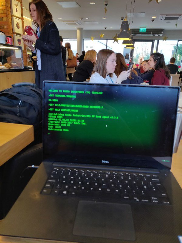 My friend Ivan looking at the game in a coffee shop
My improvements definitely feel worthwhile. The new version feels so much more vibrant and alive. Check out the difference in these two pictures, below:
The new version is just so much more vibrant - my eyes want to look at it more!
I feel like my take on the minigame is one of the most faithful that exists, which I am very proud of as I have put a lot of care and attention into it. I really like many of the other versions, but because I know so much about the minigame at this point, their flaws really stand out to me!
For example, the famous version by Mitchell Thompson’s pointers don’t make sense, the ‘bracket pairs’ can be highlighted from the closing pair (and always have a fixed width), and the bracket pairs sometimes can cross over multiple lines. The way the characters load on to the screen is also slightly wrong. Don’t get me wrong, I love it (particularly the UI), it only bothers me because I am a super nerd!
Euclio’s version is cool for what it is, but (as he/she admits), most words end up having little in common, which is a shame, and the lack of a dedicated graphical interface is sad, but it does look excellent when combined with cool retro term.
I’ve really learned a lot about front-end web development from this project, and I always encourage others to attempt similar projects. It gives you something cool to show off that people can get passionate about.
P.S. I'm late to the party, but I recently got a twitter account that you can follow here.
