Designed and Refined
Why I redesigned my homepage to better achieve its purpose.
This summer I decided to learn web development skills; I had felt somewhat impotent not being able to create webpages. It’s an important skill to know - if programming is the new literacy, then without web skills you have no way to express yourself. You have no voice.
Your web presence is your online passport. It’s your identity.
My website was the second thing I built with my newfound skill. I decided to reflect on what I had built and how it contributed to my identity.
Here’s how my homepage looked, in its entirety:
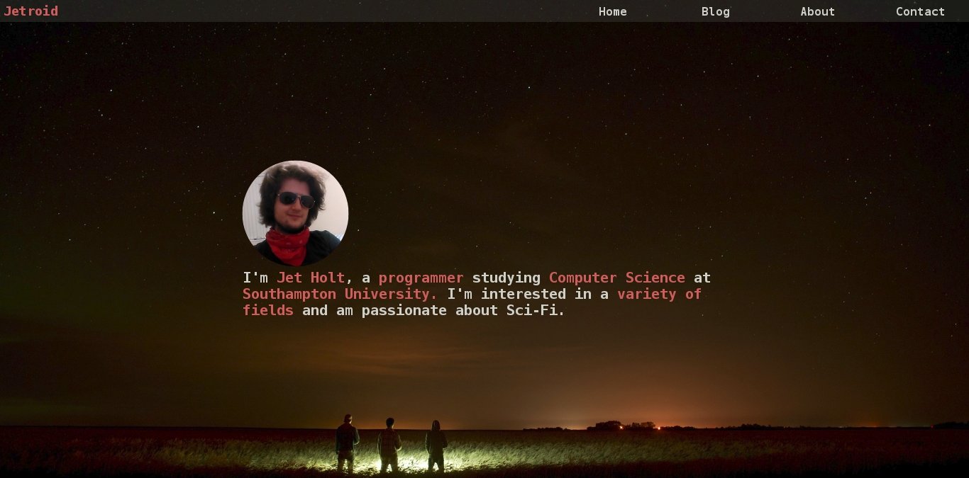 The entirety of my old homepage
Visually, it’s nice.
It’s also completely useless.
What is the purpose of your website?
To understand why I concluded that the homepage was useless, you have to ask yourself the purpose of the site and each of its pages.
I was asked recently what my website was for; what was it meant to achieve?
I thought about this, and I decided that these are the main aims:
My website should be…
- a way for individuals (or otherwise) to see at-a-glance what sort of person I am.
- a platform for me to be able to write useful posts. (tips, tutorials, etc)
- a record of the projects I complete. (more for my own self-worth than anything else)
- a source for people to find my latest undertaking, whatever that may be.
- a hub linking to all of my important web presence.
In the original design, the homepage said some brief things about who I am and what I like. Great! But that’s all the homepage did. The rest of the aims are met on other pages.
I realised that the homepage is where you should come for all the latest updates. To get those, you would have to click through to the blog:
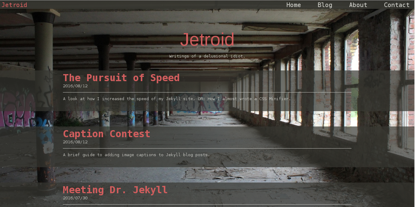 The blog page - complete with self deprecation in true british style!
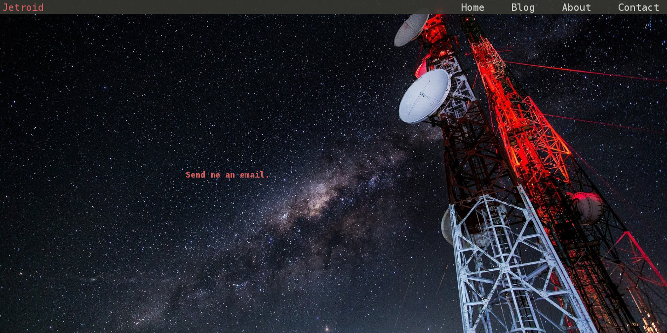
To get in touch with me, you had to visit the contact page. (A page dedicated to just my email link!)
The fact that the pages people actually wanted to visit were spread across the site was a problem.
It completely devalues the homepage.
Once somebody had seen my homepage once, they need not ever look again - it wouldn’t change! It wasn’t a useful page on the site.
How can we refine to meet our goals?
For me, the solution was obvious. I can simply remove the extra pages and merge their content. In the case of the blog links, this meant adding them below the fold. In the case of my email address, this meant adding it to my ‘blurb’.
I also added a ‘beauty picture’ as the background for each post link, to make it a little more visually interesting. As the page scrolls, the link blocks are like little windows on to the pictures. I think it looks cool!
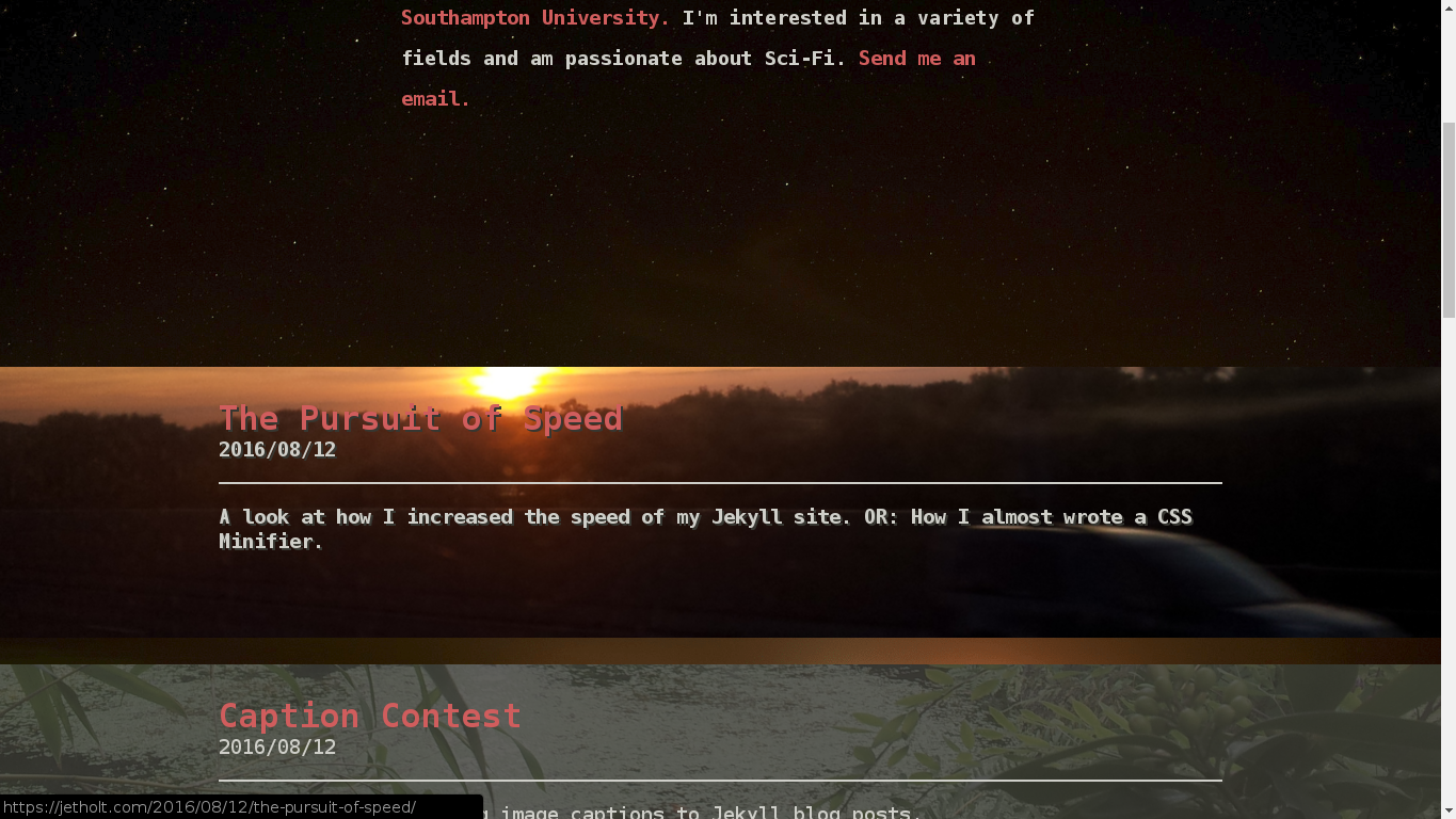 My new homepage design. Links appear below the blurb as slide-y images!
My refinements left me with a problem: I would be left with only two tabs on my navbar - Home and About.
I could either generate new pages to fill this void, or do away with the navbar completely.
My personal stance is that I don’t particularly like navbars; They’re a website version of the tabs you’d find in a folder. They hint as if to say that “all of the important content is here!”, which I personally feel disincentivises page exploration.
I chose to remove the navbar and link to pages through posts or my homepages’ ‘blurb’.
Why did the original design have these flaws?
A good part of interaction design is using familiar UI elements.
I initially used a navbar as it would mean that users would intuitively know how to navigate the site.
Unfortunately, Navbars generally come with some standard links; Home, About, Contact, etc. I feel that the ubiquity of these pages made me psychologically feel that I needed them too. This lead to me putting content on separate pages when it would be better on the homepage.
Why is the new design better than the original?
My homepage is now a proper hub for my site. There is a reason to visit it, as all the posts appear there. The use of the ‘beauty pictures’ as backgrounds for the posts makes them much less monotonous.
I would much rather people explored my website organically, experiencing delight when they discover a page they like. A navbar prevents this and disincentives exploration with the idea that “It’s all there”. Without a navbar, I won’t link directly to my ‘cooler’ pages. (eg, previously I linked to my Fallout hacking minigame on a drop-down for the ‘Blog’ on the navbar). I will link to important pages in my ‘blurb’ on my homepage, but the fun pages will only be linked to from other pages, meaning the site has more depth for visitors and rewards exploration.
I retain much more consistency in my site. Links to other pages use the pink highlight effect, whereas the Navbar links were plain white.
Could I improve my design further?
I think so!
I’m toying with the idea of having the most recent post appear above the fold on the homepage, so that you can see instantly see if there is a new post or not.
I’m also toying with the idea of splitting the about page into /about and /timeline. The timeline section is much more dynamic than the about section, and will eventually grow much larger than the about section. If the timeline had it’s own page, I would be free to expand it as much as I liked. I could add my posts as entries there, for example.
I need to add linkbacks to the homepage from all the subpages. The one downside of removing the navbar that I recognise is that it is not easily possible using just the site’s UI to navigate back to the home page. A fixed link in the top left that follows you as you scroll should rectify this.
As I post more, I will need to add pagination to keep the site loading fast. This will make finding an individual post harder, so I will probably make an /index page that people can use. (Or add my posts to a /timeline page. Or both!)
P.S. I'm late to the party, but I recently got a twitter account that you can follow here.