Automatic Responsive Images on Jekyll without Plugins
A tutorial on how to automatically generate responsive images for Jekyll, without using plugins.
In modern web development, the biggest resources that the client has to load to render a website are typically the images. HTTP Archive currently shows that 50% of the bytes transferred on a typical site are for images. There are a lot of strategies being employed on the web right now to reduce this cost, like optimising images, forcing all images to a reasonable size, lazily loading images, or making images responsive. As I have been adding more and more images to my website, images have become a bigger and bigger problem for me.
Plugin-based solutions already exist for responsive images and lazy loading, but for many people who use GitHub for their site, these solutions are not workable as GitHub does not support the plugin(s). I want to be able to take advantage of Responsive Images and Lazy Loading, so have devised a solution using Git Hooks and clever manipulation of liquid logic.
I already detailed how to automatically optimise images without plugins on Jekyll, and this post is going to build upon the process I used there to also create responsively-sizes images for use in resolution switching. I’m also going to be leveraging this lazy loading library to painlessly lazy load our img tag content too, as our method to alter the markdown-generated img tags to add the resolution-switching makes it easy to add lazy loading too.
What are Responsive Images?
If you know what responsive images are, skip to the next section - otherwise, read on.
To best illustrate what responsive images are, let’s describe a situation where Responsive Images are not used, and identify the problems.
Gary is a web developer working to create a website for a school in Pittsburgh. Let’s say this website needs to have a handful of images, some text, and a few links. The higher ups tell him it needs to look good on large screens as the district governor will be looking at it on a 2560x1440 monitor, but it also needs to look good and work well on a phone or tablet, as that is the medium used by most prospective parents.
Like any good web developer, Gary knows he can offer a slightly different layout to different devices with different screen sizes to offer a better experience. He creates a layout with a 80% width image as a header, and then differing numbers of columns for the body - two column for desktops, laptops, and tablets, and one column on mobile. He calculates that he needs an image of 2048 pixels wide so that the header image looks pixel perfect on the larger monitor, and image widths of 800 pixels for images in the two column layout.
After working tirelessly for a week, Gary looks at his work on his development machine, and was pleased. He pushed it to live and looked at it on his mobile phone, connecting with a slow 3G connection. The site looked great - but the images took a long time to load. Gary realised that this was because he served sizes he selected for the larger desktop screen, and that he had not tailored them to the mobile screen. Assuming his phone screen was a single density 400px width display, he only needed to serve images of 320px for 80% width images on the mobile. Additionally, he notices that some of the details that were so clear in the pictures on the desktop screen are hard to make out on the mobile, as they are rendered much smaller. Gary sees that the layout he designed would have worked better if the image was cropped to accentuate those details.
Responsive Images is the idea that the one-size-fits-all images of the past, where every device regardless of profile must make do with a given image, should be replaced with techniques to situationally load images that are tailored to different screen sizes. The most frequent use case for Responsive Images is resolution switching to serve content optimally for a given device - only serving the resolution of image that can be displayed on a given device, to make the page loads quicker and be less expensive to the end user (and maybe less expensive to the provider too!) Sometimes it is also used to improve the ‘art direction’, ie adjusting the actual picture (not just the resolution) to better highlight the image - this could involve cropping, adding effects, or even serving a different image entirely.
Resolution switching will be the primary focus of this article as it can be automated, whereas art direction requires more of a human eye and designer’s flair. Additionally, we will be adding lazy loading for our img tags, as it will be a cheap, painless, and effective addition.
New Image Resolution Generation
Before we go any further, we need to decide which resolutions we want to generate. Empirical evidence by Paolo Mioni suggests that for an image that covers 100% of the width of the screen, the resolutions to generate should have widths of 1920, 1600, 1366, 1024, 768, and 640 pixels. If possible, it’s probably worthwhile trying to run the experiment yourself and seeing which resolutions actually get used, but I’m not in a position to run such an experiment, and Paolo’s reasoning for his different sizes seem reasonable.
My background images cover 100% of the width of the screen, so I’ll be using Paolo’s resolutions for my background images. However, my blog design has borders which take up variable width depending on your screen size, which means that my image content in <img /> tags don’t take up 100% of the screen. For example, on large screens over 1000px wide, I have borders of 18 percent of the screen width on both sides, meaning the image takes up a total of 64% of the screen. As the 1920 resolution is over the 1000px breakpoint, we need to reduce it to 64% of it’s size. target_resolution = percent_width_of_image * original_resolution. For me, the calculation looked like this: 0.64*1920 = 1228.8 ≈ 1230. I think it’s definitely worthwhile looking through your media queries and determining what width your image will have at the different break points, then picking the resolution based on that calculation. Additionally, take note of the different percentage widths of the image at these breakpoints - that information will be useful later!
For my img tags and media queries, Paolo’s breakpoints converted to 1230, 1024, 874, 655, 655, and 560 pixels, and the widths of the image at my breakpoints were 64% above 1000px, 76% above 800px, 88% above 500px, and 82% otherwise. Note that the resolution 655px was repeated twice - the actual recalculations for Paolo’s 1024px and 768px resolutions were slightly different, but close enough that it wasn’t worth justifying an extra resolution.
To be able to serve different resolution images, we need to generate them on the backend. If you can use plugins, this is trivial - generate them at compile time using a plugin or write your own. Ivo Valchev wrote a fairly good guide for this.
To distinguish between our background images, and our content images, I put them in different directories. I created a assets/images/backgrounds/ directory and a assets/images/content/ directory, and moved the images accordingly. In the cases where I used the same image for both content and a background, I unfortunately had to duplicate it. Images which apply to neither category, I left in the assets/images/ directory. You might have all different kinds of images which need all kinds of different resolution resizings, so create your folders accordingly.
We aren’t going to be using plugins, so we are going to be using Git Hooks. Git Hooks are points in the git process that allow you to run scripts before or after you execute git commands like git push, git merge, or git rebase. The one we are interested in is the pre-commit hook, which runs just before git commit is run. A script that is run at this part of the commit pipeline can therefore modify staged files, or stage new files, and have these modifications and additions be added to the commit. Create the file .git/hooks/pre-commit and add the following content for it to automatically run our script when you commit:
#!/bin/sh
python responsiveimages.py
Next, we need to actually create our script that will be run by the git hook. I’m basing this on the script I created to automatically compress images, so it should look familiar if you have seen that. Create the file responsiveimages.py in the root directory of your jekyll repository and add the following content:
For your convenience, it is also available as a gist here.
import yaml
import os
import git
import subprocess

YAML_FILE = "processed.md"
FOLDERS = {
    "assets/images/backgrounds/":[1920,1600,1366,1024,768,640],
    "assets/images/content/":[1230,1024,874,655,560],
    "assets/images/":[] #Do not make any additional sizes
    }

#Link git with python
repo = git.Repo()
#Get the staged files
diffs = repo.index.diff('HEAD')
staged_files = [x.a_blob.path for x in diffs if hasattr(x, 'a_blob') and x.a_blob != None ]

#If not images in staged files, let's quit
has_some_image = False
for file in staged_files:
    if file.endswith(".jpg") or file.endswith(".jpeg") or file.endswith(".png"):
        has_some_image = True
        break
if not has_some_image:
    quit()

#Directory of this file
dir = os.path.dirname(os.path.abspath(__file__))

#For each gallery directory, find all files and build the yaml.
for folder in FOLDERS.keys():

    #generate the path to the yaml file Jekyll will use
    folderpath = os.path.join(dir, folder)
    yamlfile = os.path.join(folderpath, YAML_FILE)

    #Generate a list of images the yaml file knows about
    #These images won't need compressing and resizing as they already are.
    knownimages = []
    if os.path.exists(yamlfile):
        stream = open(yamlfile, 'r')
        data = yaml.load_all(stream)
        knownimages = next(data)['images'] or []
        stream.close()

    #Generate a list of images that are there right now
    realimages = []
    for file in os.listdir(folderpath):
        if file.endswith(".jpg") or file.endswith(".jpeg"):
            realimages.append(file)
        elif file.endswith(".png"):
            realimages.append(file)

    #Some images may have been removed since the yaml was last updated
    #Let's remove those entries
    images = [img for img in knownimages if img in realimages]

    #Now get the images that need compressing and adding to the yaml
    newimages = [img for img in realimages if img not in knownimages]

    #Compress the image and remember it
    for image in realimages:
        imagepath = os.path.join(folder, image)
        imagenoext = os.path.splitext(image)[0]

        #Compress, re-stage, and remember the images
        #We also want to create the smaller and larger sized resolutions
        if imagepath in staged_files:

        	#Get the width of the image
        	width = int(subprocess.check_output("identify -format \"%[w]\" " + imagepath, shell=True))

            if image.endswith(".jpg") or image.endswith(".jpeg"):
                #Generate all of the resized versions
                for size in FOLDERS[folder]:
                	newsizeimage = imagenoext + "-" + str(size) + ".jpg"
        			newsizeimagepath = os.path.join(folder, newsizeimage)

                    #If our image is say 800px wide, but we're asked to make it 1000px,
                    #obviously we're upsizing which is bad for storage space.
                    #If DONOTUPSIZE is set, we don't do that, simply using the original image
                    #Otherwise we upsize.
                    if size > width:
                        #Just save the new file as an optimisation of the original
                        os.system("convert " + imagepath + " -sampling-factor 4:2:0 -strip -quality 85 -interlace JPEG -colorspace RGB " + newsizeimagepath)
                    else:
                        os.system("convert " + imagepath + " -sampling-factor 4:2:0 -strip -resize " + str(size) + "x -quality 85 -interlace JPEG -colorspace RGB " + newsizeimagepath)
                    #Add the resized image
                	images.append(newsizeimage);
                    repo.git.add(newsizeimagepath)
                #Optimise the original
                os.system("convert " + imagepath + " -sampling-factor 4:2:0 -strip -quality 85 -interlace JPEG -colorspace RGB " + imagepath)
            elif image.endswith(".png"):
                #Optimise the original
                os.system("optipng -quiet -o1 -strip all " + imagepath);

                #Generate all of the resized versions
                for size in FOLDERS[folder]:
                	newsizeimage = imagenoext + "-" + str(size) + ".png"
        			newsizeimagepath = os.path.join(folder, newsizeimage)
                    #Convert the image
                    if size > width:
                        #Just save the new file as an copy of the original
                        os.system("cp " + imagepath + " " + newsizeimagepath)
                    else:
                        #Make it smaller
                        os.system("convert " + imagepath + " -strip -resize " + str(size) + "x " + newsizeimagepath)
                        #Also optimise it
                        os.system("optipng -quiet -o1 -strip all " + newsizeimagepath)
                    #Add the resized image
                	images.append(newsizeimage);
                    repo.git.add(newsizeimagepath)
            #Add the optimised original image
            repo.git.add(imagepath)
            #Remember the images
            images.append(image)

    #Write the new yaml
    with open(yamlfile, 'w+') as outfile:
        outfile.write("---\n")
        yaml.dump({'images':images}, outfile, default_flow_style=False)
        outfile.write("---")
    repo.git.add(yamlfile)
A few important notes:
This script also optimises (read: 85% lossy compression for JPG, lossless for PNG) newly-committed images. If your original images are already optimised and you do not want to optimise them further, then simply comment out or delete the
os.system(...)call beneath the two#Optimise the originalcomments.The file specified in YAML_FILE will be created in each of the folders listed in FOLDERS. The purpose of this file is to list all files that have already been processed to ensure that they are not processed a second time. It is probably desirable to commit this to your repository, so that these images are not reprocessed (or worse, have the resized images processed!) when the repository is cloned on a new machine.
This script requires PyYAML, PyGit, ImageMagick, and OptiPNG. I’ve only tested the os.system() calls on Linux - not sure how this sort of thing works on Windows and MacOS.
Change FOLDERS to correctly point to the folders and resolutions you want to use. If you don’t want to create additional sizes for a folder, just add an empty array and it’ll work fine.
This script does NOT upscale images. By this I mean that if an image is 400px wide, and one of your resolutions is 800px, then it will intentionally NOT create an 800px image, simply creating a file with the appropriate name but with the original 400px. The 800px image will have no more quality than the 400px image, and so in my opinion wasteful of resources. However, it’s possible that your design differs to mine and that this decision breaks the layout of your site. If this design decision gives adverse results for you, remove both
if size > width:conditions and just use theelse:clauses.
Image Tag Srcset Generation
If you followed everything correctly so far, then every time you commit a .jpg or .png image, the git hook will trigger and the responsiveimages.py script will be executed to create a set of resized resolutions. Great! Let’s get to work on displaying them.
I’ve based this solution on the post by my good friend Matt, who wanted to add LazyLoading to his Jekyll site. In fact, it was reading his post that made me realise it was possible to do responsive images without plugins at all! Thanks Matt!
Somewhere in your layouts for the posts on your site, you likely have written somewhere (perhaps in multiple places?) {{ content }} (or perhaps {{ post.content }} or something similar). Jekyll takes your markdown post, converts it into HTML, and puts it here. Our strategy involves the fact that, at this time, the post is essentially just a string that we can manipulate. And further, because Jekyll converts the markdown in a predictable way, we can manipulate it easily. Warning: This method MAY NOT WORK if you’re inserting img tags manually into your markdown posts. This ONLY WORKS RELIABLY if you write something like !
Now, I’m going to be providing a version of the code that is intended for lazy loading. If you don’t want to use lazy loading (Why?), then simply delete the <noscript> tag and remove the data- prefix from the img tag properties.
Replace your {{ content }} tag with the following:
For your convenience, it is also available as a gist here.
{%- assign pieces = content | split: '<img src="' -%}
{%- for piece in pieces -%}
	{%- if forloop.first == true -%}
		{{ piece }}
	{%- else -%}
		{%- if piece contains '" alt="' -%}
			{%- assign url = piece | split: '" alt="' | first -%}
			{%- assign alt = piece | split: '" alt="' | shift | join: '" alt="' | split: '"' | first -%}
			{%- assign rest = piece | split: '" alt="' | shift | join: '" alt="' | split: '"' | shift | join: '"' -%}
			{%- assign url-filename = url | split: '.' | pop | join: '.' -%}
			{%- assign url-extension = url | split: '.' | last -%}
			{%- if url-extension == "gif" -%}
				<noscript><img src="{{ url }}" alt={{alt}} /></noscript>
				<img class="lazy" data-src="{{ url }}" alt={{alt}}{{ rest }}
			{%- else -%}
			<noscript><img
				srcset="{{ url-filename }}-560.{{ url-extension }} 560w,
						{{ url-filename }}-655.{{ url-extension }} 655w,
						{{ url-filename }}-874.{{ url-extension }} 874w,
						{{ url-filename }}-1024.{{ url-extension }} 1024w,
						{{ url-filename }}-1230.{{ url-extension }} 1230w"
				sizes="(max-width:499px) 82vw,
						(max-width:799px) 88vw,
						(max-width:999px) 76vw,
						64vw"
				src="{{ url }}" alt="{{ alt }}" /></noscript>
						<img class="lazy"
				data-src="{{ url }}"
			data-srcset="{{ url-filename }}-560.{{ url-extension }} 560w,
						{{ url-filename }}-655.{{ url-extension }} 655w,
						{{ url-filename }}-874.{{ url-extension }} 874w,
						{{ url-filename }}-1024.{{ url-extension }} 1024w,
						{{ url-filename }}-1230.{{ url-extension }} 1230w"
			data-sizes="82vw,
						(min-width:500px) 88vw,
						(min-width:800px) 76vw,
						(min-width:1000px) 64vw"
			alt="{{ alt }}"{{ rest }}
			{%- endif -%}
		{%- else -%}
			{%- assign url = piece | split: '"' | first -%}
			{%- assign rest = piece | split: '"' | shift | join: '"' -%}
			{%- assign url-filename = url | split: '.' |  pop | join: '.' -%}
			{%- assign url-extension = url | split: '.' | last -%}
			{%- if url-extension == "gif" -%}
				<noscript><img src="{{ url }}" /></noscript>
				<img class="lazy" data-src="{{ url }}"{{ rest }}
			{%- else -%}
			<noscript><img
				srcset="{{ url-filename }}-560.{{ url-extension }} 560w,
						{{ url-filename }}-655.{{ url-extension }} 655w,
						{{ url-filename }}-874.{{ url-extension }} 874w,
						{{ url-filename }}-1024.{{ url-extension }} 1024w,
						{{ url-filename }}-1230.{{ url-extension }} 1230w"
				sizes="(max-width:499px) 82vw,
						(max-width:799px) 88vw,
						(max-width:999px) 76vw,
						64vw"
				src="{{ url }}" alt="{{ alt }}" /></noscript>
						<img class="lazy"
				data-src="{{ url }}"
			data-srcset="{{ url-filename }}-560.{{ url-extension }} 560w,
						{{ url-filename }}-655.{{ url-extension }} 655w,
						{{ url-filename }}-874.{{ url-extension }} 874w,
						{{ url-filename }}-1024.{{ url-extension }} 1024w,
						{{ url-filename }}-1230.{{ url-extension }} 1230w"
			data-sizes="82vw,
						(min-width:500px) 88vw,
						(min-width:800px) 76vw,
						(min-width:1000px) 64vw"{{ rest }}
			{%- endif -%}
		{%- endif -%}
	{%- endif -%}
{%- endfor -%}
This liquid logic works by taking some HTML - which might look like <p>Some text here.</p><img src="" alt="" /><h1>Some title here.</h1>, and then ‘cutting out’ the <img src="" alt="" part, leaving the HTML as two chunks - <p>Some text here.</p> and /><h1>Some title here.</h1>. We harvest the information from both the src and the alt properties, and then insert new HTML (to lazily and responsively load the image) between the two chunks of HTML. The end result is that we essentially added additional properties to the img tag, and added an additional <noscript><img src="" alt="" /></noscript> fallback for if JavaScript is not enabled (so that things continue working as if we hadn’t tried to lazy load it).
It is important that you go through the srcset and data-srcset properties and replace the values with those resolutions that you calculated in the previous section (As a reminder, for me these were the sizes 1230, 1024, 874, 655, and 560). srcset is a way of telling the browser about different sizes of image and what URL they are it without it having to load them, so that it can choose which is best. The sizes and data-sizes properties tell the browser what resolution the image will be at different resolution breakpoints to help it determine which of the srcset images is best to choose. This is where taking a note of your media query breakpoints earlier comes in useful - go through the sizes and data-sizes and put your own breakpoints there. It’s okay if you have to create or delete lines to add your srcset resolutions of sizes breakpoints - you may have more or less than me - it just depends on your design.
Lazy Loading Enable
One final thing before we move on from img tags - we need to enable lazy loading, or our images won’t show up at all. If you decided you didn’t want to use lazy loading (and therefore deleted the <noscript> tag and the data- prefix), then you can skip this section.
Somewhere - probably in the same file as where you replaced {{ content }}{% raw %} in the previous section - you want to add the script tag that loads the lazy loading library. I decided to use the code they provide to conditionally load the best script for the browser. It’s probably best for you to look at the ReadMe file yourself to pull the latest conditional load code, but here is the code I got:
(function(w, d){
    var b = d.getElementsByTagName('body')[0];
    var s = d.createElement("script");
    var v = !("IntersectionObserver" in w) ? "8.17.0" : "10.19.0";
    s.async = true; // This includes the script as async. See the "recipes" section for more information about async loading of LazyLoad.
    s.src = "https://cdn.jsdelivr.net/npm/vanilla-lazyload@" + v + "/dist/lazyload.min.js";
    w.lazyLoadOptions = {};
    b.appendChild(s);
}(window, document));
Just throw this in a script tag as far down in the HTML of your page as you can get away with, and your lazy loading will work, just like that. Boom!
Thanks to everyone who worked on the library!
Background Image Media Queries
If you’ve looked at my homepage at all, you will see that rather than img tags, I have a lot of divs with the background-image property. I think it looks really cool like this - that’s just my personal opinion. I also have a background-image on every page. If you don’t use background-image at all in your design, then firstly be grateful, and secondly skip to my summary of the limitations of our approach
Unfortunately, background-image doesn’t have any capabilities to make responsive images nicely. There is no srcset for background-image. No sizes. Hopefully we get something like this one day!
The only solution here we currently have available for background-image is media queries. Media Queries are not a good solution to responsive images. It isn’t possible to exhaustively create media queries to perfectly cover every possible screen dimensions and pixel depth, and even if you did, you’d be generating a lot of CSS!
So my solution here is less than ideal, and might even be more hassle than it is worth. I decided to just support 1x screen densities. After adding this solution to my homepage - which includes twelve background images at a time - the majority of the css for my homepage is media queries determining image resolution. In fact, the length of the css just for these media queries is longer than the HTML that creates the post list. So I’m still considering if I want to use this for the post list on my homepage.
I think there is some value in adding this for you to use, so here it is:
{% raw %}{% capture background-image %}{% if page.background %}{{ page.background }}{% elsif layout.background %}{{ layout.background }}{% else %}default-background.jpg{% endif %}{% endcapture %}
{% assign image-extension = background-image | split: '.' | last %}
{% assign image-name = background-image | split: '.' | pop | join: '.' %}

/* Our cutoffs for backgrounds are at 1920,1600,1366,1024,768,640 */
/* Default size will be 640 (mobile first) */
body {
	background-image: url("/assets/images/backgrounds/{{ image-name }}-640.{{ image-extension }}");
}
/* Now what if we're bigger than 640? We want next size up, etc */
@media (min-width: 641px){
	body {
		background-image: url("/assets/images/backgrounds/{{ image-name }}-768.{{ image-extension }}");
	}
}
@media (min-width: 769px){
	body {
		background-image: url("/assets/images/backgrounds/{{ image-name }}-1024.{{ image-extension }}");
	}
}
@media (min-width: 1025px){
	body {
		background-image: url("/assets/images/backgrounds/{{ image-name }}-1366.{{ image-extension }}");
	}
}
@media (min-width: 1367px){
	body {
		background-image: url("/assets/images/backgrounds/{{ image-name }}-1600.{{ image-extension }}");
	}
}
@media (min-width: 1601px){
	body {
		background-image: url("/assets/images/backgrounds/{{ image-name }}-1920.{{ image-extension }}");
	}
}
/* Gone past all our breakpoints... show the original image now instead */
@media (min-width: 1921px){
	body {
		background-image: url("/assets/images/backgrounds/{{ image-name }}.{{ image-extension }}");
	}
}
This code works for 100% width background images, so if your background-images are used in a similar way to mine, then it requires no modification.
Limitations
This approach isn’t perfect - by far!
- We’re using a lot more filesystem space. My GitHub repository increased from 240MB to 380MB, which is a more than 50% increase. GitHub has a maximum (compressed) repository size of 1GB, so I only have “so much time” until I can’t use it any more. For reference, I have a few dozen posts and around 300 images.
- The image srcset creation and background image media queries code is dumb. Sadly, liquid logic gives no access to the filesystem - this would be a huge security hole! This means that if a file is missing, it doesn’t know not to include it in the
srcset. This has some real disadvantages. It means that our image generation script,responsiveimages.py, has to generate files for all sizes, even if those sizes are larger than the base image!. I tried to make theresponsiveimages.pyscript smart-er by generating those ‘larger’ resolution files at the same size as the base image, but it’s not perfect. This means we’re using a lot more filesystem space to store the images than we need to, making problem #1 even worse. (For what it’s worth, I can think of two different workarounds that would avoid this problem, but I don’t think either are worth the time to pursue and implement.) - The background image media queries are very simplistic - they only support 1x screen densities, which probably isn’t realistic on the modern web. My mobile phone has a higher (hardware) screen resolution than my laptop. So I’m actually making my site look worse by doing this. Oops.
- I actually didn’t realise this one until I started writing the results section of this post. You can’t preview your images as you are writing a post, because srcset will point you to one of the resized images, which won’t be generated until you commit. Edit: I figured out that you can actually fix this by wrapping everything the image srcset generation with a
{%- if jekyll.environment == "production" -%}and a{%- else -%}{{ content }}{%- endif -%}. GitHub Pages automatically has the Jekyll environment set to production, but you probably don’t locally.
Results
I tested my site on GTmetrix before and after I made these changes.
Site Homepage:
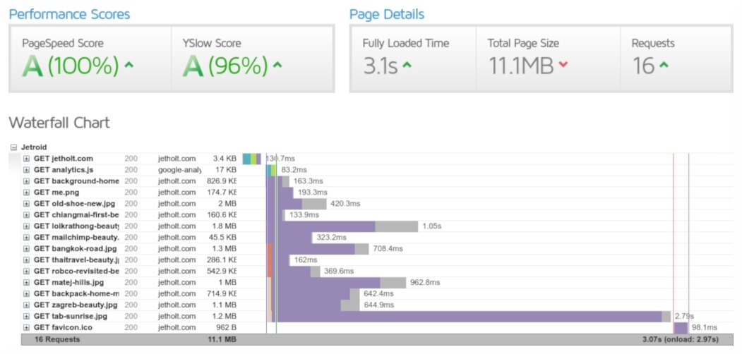 My site homepage before responsive images.
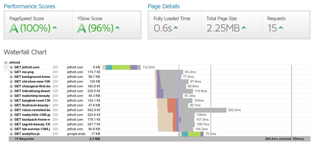 My site homepage after responsive images. 5x faster and 5x less data transferred.
A Blog Post:
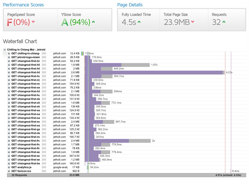 Terrible! A post before responsive images and lazy loading. The images are really heavy here.
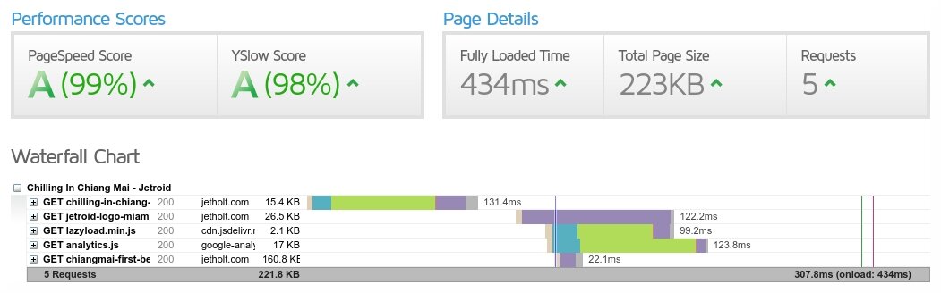 A post after responsive images and lazy loading. 11x faster and 120x less data. Lazy Loading really helped here.
I find it interesting that PageSpeed and YSlow can be so high on some of these, despite them having (relatively) much slower speeds than the more responsive and optimised ones.
Altogether, I think the results of this was definitely worth doing. I’m not somebody who takes time cropping images to all be a consistent size (it takes me long enough to add images to my blog posts), so it’s nice to have an automated system to ‘save me’ when I do badly and prevents me from serving 3MB images all over the place.
P.S. I'm late to the party, but I recently got a twitter account that you can follow here.